
A closer look at the design
Considered work.
Honestly presented.
One own-project example, shown for its design—not dressed up as a paying client, testimonial or commercial success story.
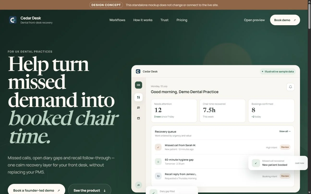
Cedar Desk
Marketing-page design
Structure / visual design / responsive layout
The design decisions
A distinct identity.
A calmer way in.
Make the message easy to follow
The page gives the main proposition a clear hierarchy, then introduces the detail beneath it. A restrained colour palette and generous spacing keep the message from competing with the interface.
Make the brand recognisable
Forest green, warm cream and a contrasting serif headline create a consistent visual identity. The point is not to use these colours for everyone—it is to choose a direction that belongs to the business.
Be clear about what this proves
Cedar Desk is an own project, not a paying District Web client. These images demonstrate marketing-page design only. They do not claim customer results, product readiness or a testimonial.
The live Cedar Desk site is access-restricted. That protection remains unchanged; no private application screens or customer information are published here.
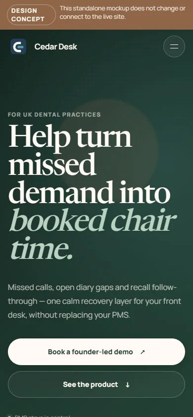
Same identity, smaller screen
Designed to adapt,
not just shrink.
Content order, readable type and clear actions matter as much on a phone as on a desktop.
Discuss a website for your business